Breathing in new life to a legacy app in the save & invest sector
I led the design effort to revitalise Silo, a fintech app that had languished in a 'hibernated' state for years, missing key opportunities in a competitive market.
Killik & Co, a British retail investment firm, conceived Silo in 2015 as an app-based solution to help new savers and investors make regular contributions to funds tailored to individual risk profiles.
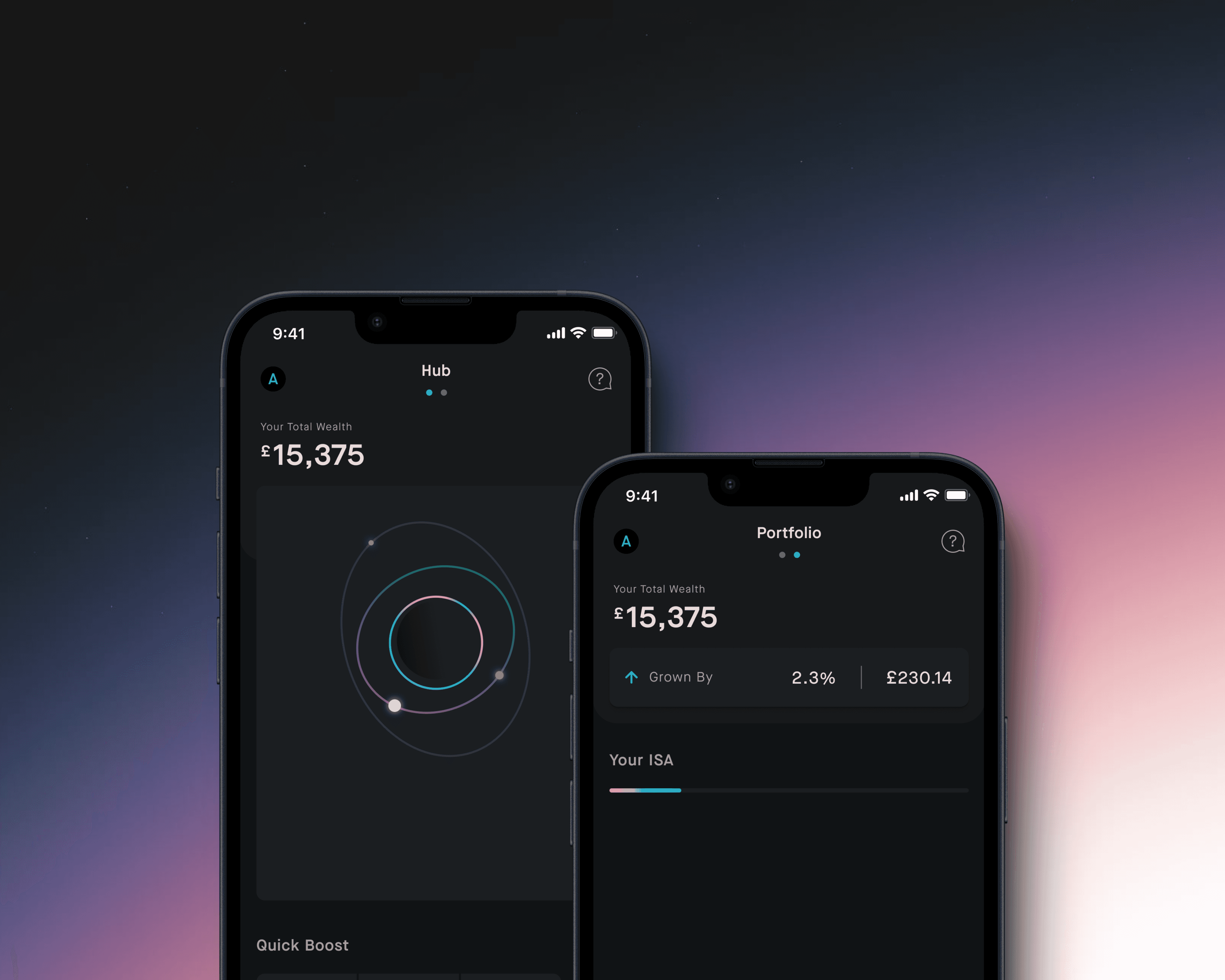
Although this concept is now common, Silo was ahead of its time, emerging in the early days of Fintech. Introducing a dark mode before it became a design trend, the app's "Rings & Orbs" visual metaphor, inspired by space and celestial bodies, represents the user's investment journey—where rings symbolise investment cycles and orbs denote specific injections of money.
Timeline
Jan. 2020 – May 2021
Role
Product Designer
My contribution
Discovery
Ideation
Prototyping
Visual Design
User testing
Team
1 x Product Designer (myself)
1 x Product Manager
1 x Frontend Engineer
2 x Backend Engineers
1 x QA Tester
Facing a 5-year design gap: overcoming delays and modernizing Silo
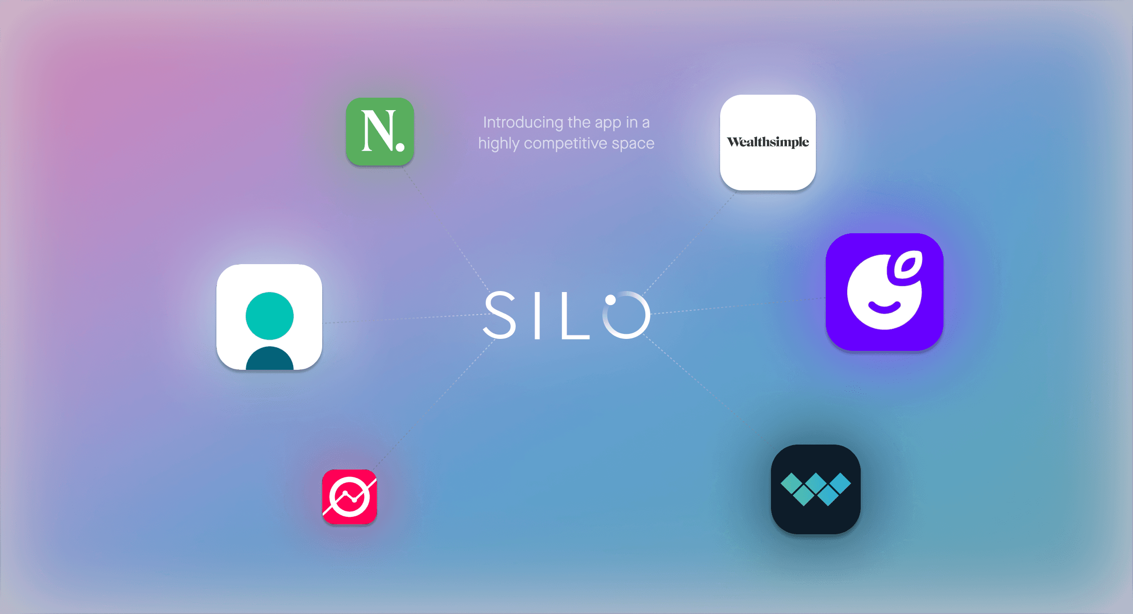
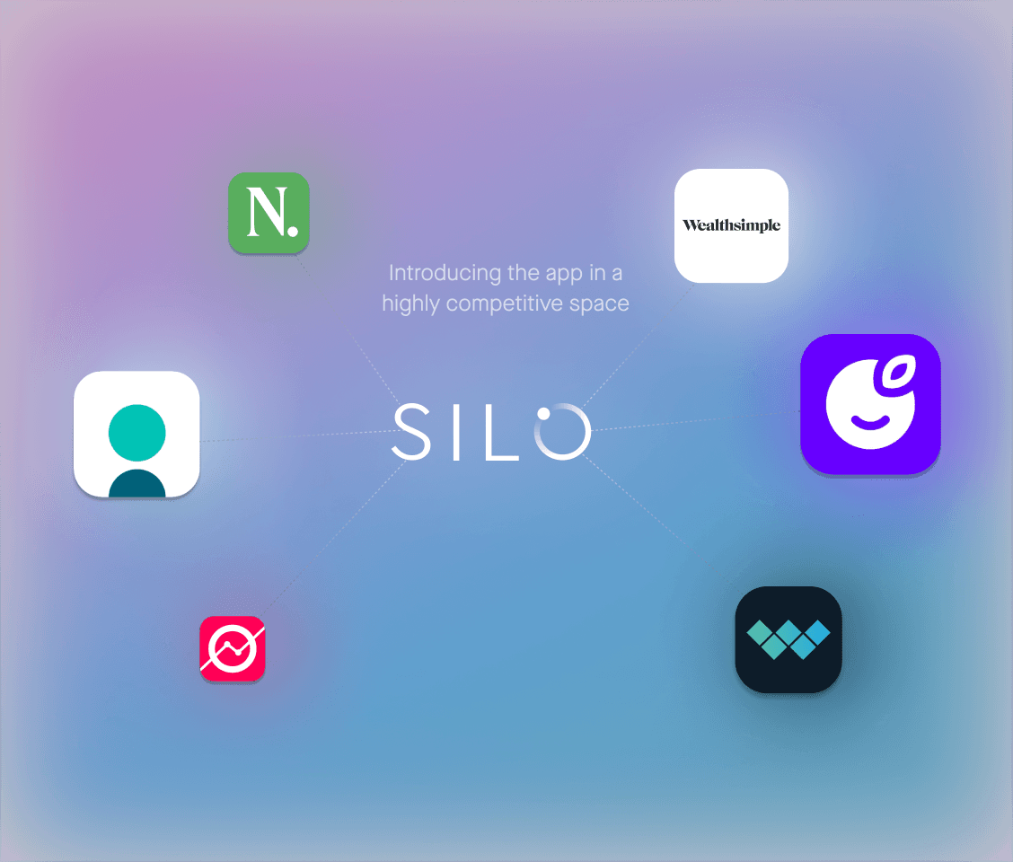
Significant delays postponed Silo's launch, and by the time it finally debuted in 2020, it had missed a crucial opportunity to outpace UK competitors. In the fast-evolving world of mobile design, a 5-year span represents a substantial gap, leaving Silo in a 'hibernated' state while newer players like Nutmeg, Plum, and Wealthsimple surged ahead.
Before joining the company, I recognized the app's poor condition and accepted the role only after securing a commitment to prioritise its improvement. The extensive changes required, along with the challenges of a small, resource-constrained team and a remote engineering team, made the transition to a more modern design application essential.
The primary goal was to close the perceived quality gap between Silo and the newer players in the market—in essence, to modernise Silo. Could we succeed under such conditions?
A twofold transformation: modernizing Silo’s aesthetics and architecture
I quickly realised that nearly every aspect of Silo needed improvement, requiring a blend of practicality with both tactical and strategic foresight. Here is an overview of how I approached the task at hand:
I conducted a comprehensive app assessment and UX audit;
Performed competitor analysis to understand the UK market landscape;
Ensured early stakeholder engagement to secure buy-in;
Coordinated with the PM and FE developer to plan necessary changes, evaluate; technical constraints, and keep delivering a steady stream of updates.
The work unfolded in two phases:
Phase 1 tackled foundational issues like surfaces, typography, iconography, and color;
Phase 2 advanced these improvements further, focusing on the app’s Information Architecture (IA) to resolve overlaps and enhance core flows.
Phase 1: re-building
the foundations
While it’s impossible to convey the full scope of the work in this medium, here are the key elements of Phase 1’s structural improvements. This list is by no means exhaustive.
Software
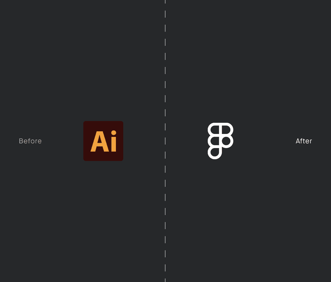
Before: Design files were housed in Adobe Illustrator, an inadequate tool for screen and app design, leading to inefficiencies and limitations.
After: The original design files, including corrupted SVGs, were meticulously recreated in Figma. This transition was essential for establishing a seamless workflow with the remote engineering team.
Surface
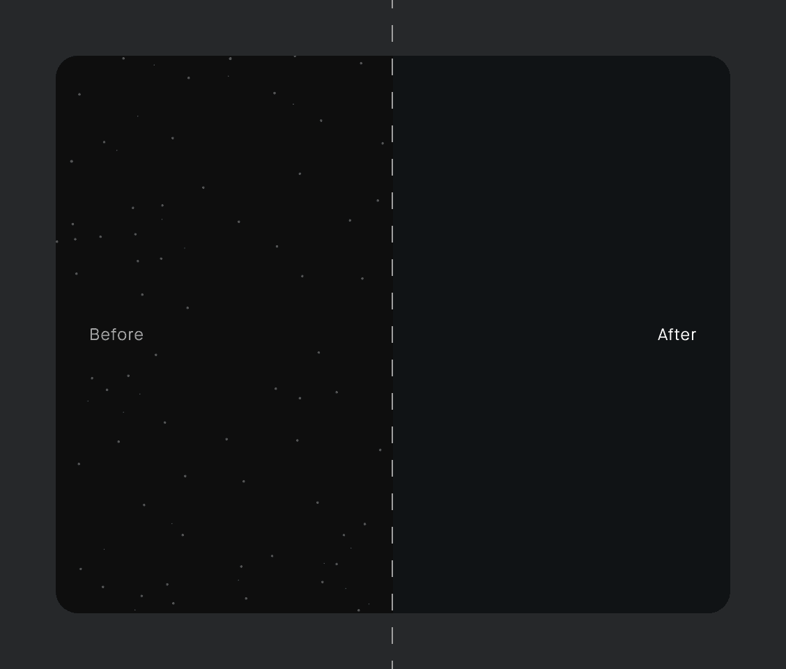
Before: A low-quality PNG background reduced overall crispness, with 'stars' that cluttered the design and impaired text readability. The overuse of full black also hindered the ability to convey elevation.
After: A simplified flat color background replaced the 'stars,' and 10 elevation levels were established for better visual depth.
Typography
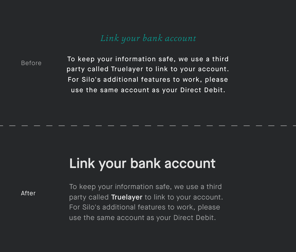
Before: A different typeface (Ashbury) and insufficient size contrast between headings and body text made headings feel inadequate for Silo's futuristic theme. An overglow effect caused by bold, 100%-white body text reduced readability;
After: Increased type sizes improved contrast, eliminated the overglow effect, and added flexibility for highlighting key text.
Iconography
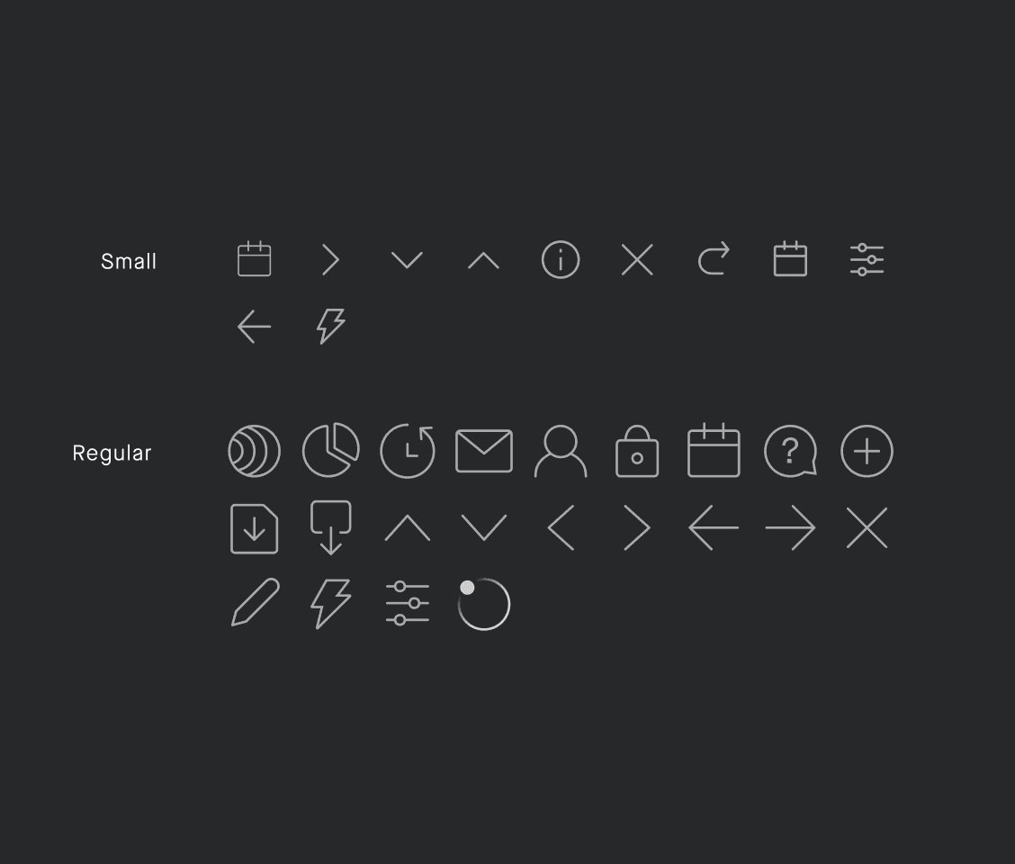
Before: The previous set of icons was poorly designed and misaligned to the grid, resulting in issues with crispness and resizing. Inconsistent visual balance made the overall set feel messy and unbalanced;
After: Icons were redesigned from scratch to address all of the issues mentioned above, achieving a more cohesive look and feel.
Colour
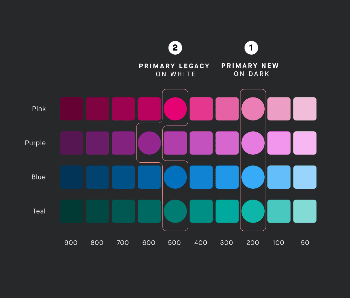
Harsh contrast ratios due to heavily saturated colours;
Lack of defined colour ramps restricted flexibility and made it challenging to experiment with different colour combinations;
Accessibility issues: only one of the four main colours met accessibility standards;
Corner radii
Before: The Silo logo featured heavily rounded corners, while other elements lacked any corner radius, resulting in a lack of visual cohesion.
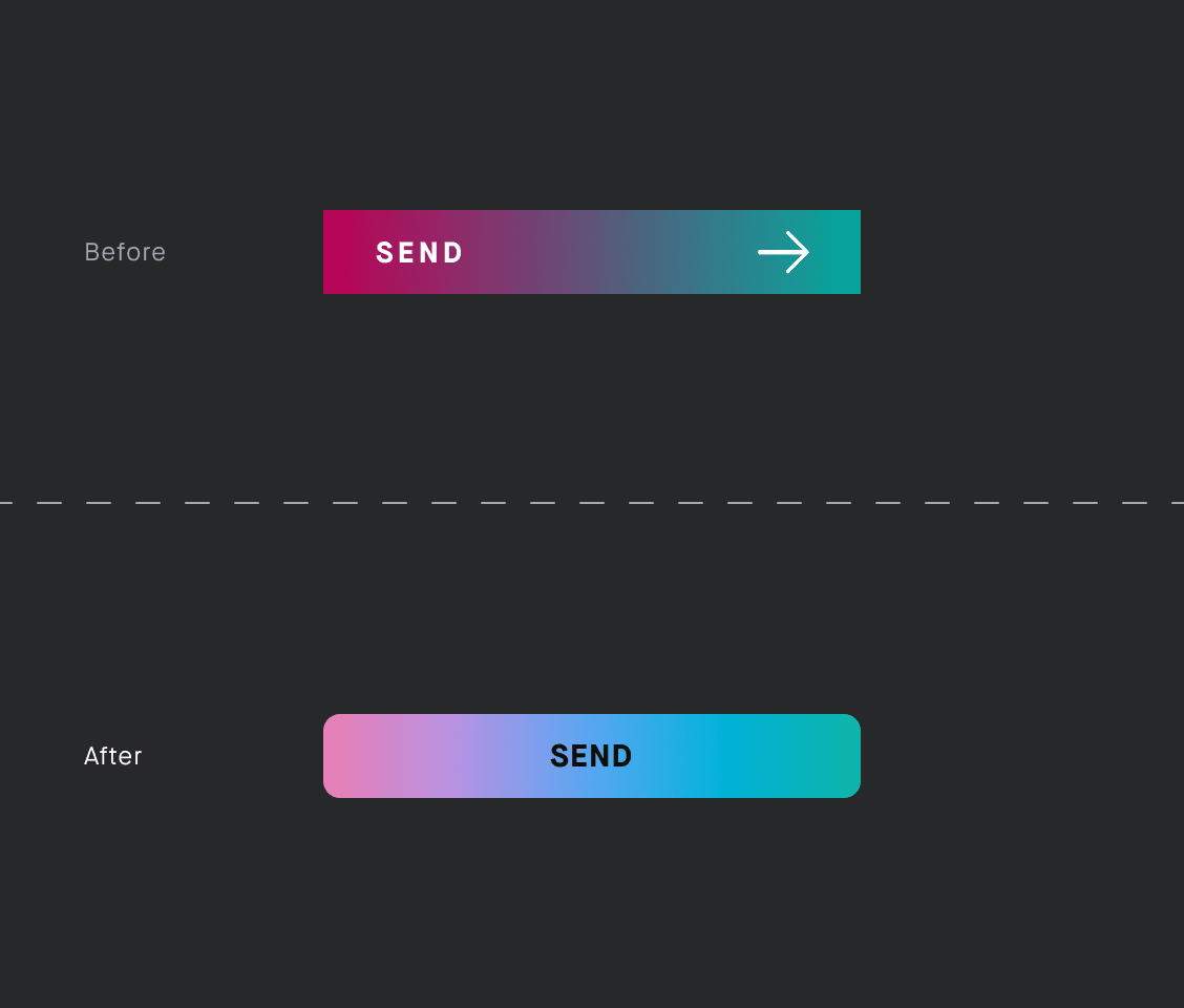
After: A small amount of corner radius was introduced to CTAs and most other elements to create a more harmonious and unified look
Phase 2: updates to the information architecture
Apart from the structural aspects, there were other issues with the app that related more to its information architecture:
The inbox section was way too prominent, despite not being used very frequently;
The lack of a proper homescreen meant that there was a partial overlap between the Activity and Portfolio sections;
This lack also resulted in a rigid structure, limiting flexibility in adding new elements.
Retrospective
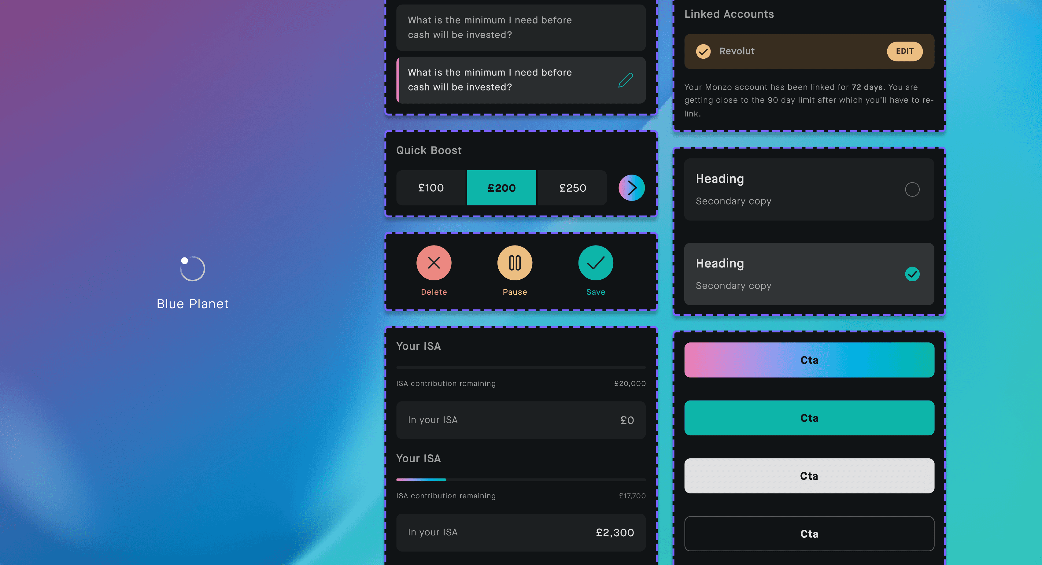
Despite the constraints of a very limited budget, I believe we made substantial improvements to Silo. Additionally, a small component library—codenamed Blue Planet—was established, something that seemed unthinkable when I first joined. The engineers also began using Storybook to further enhance our development process.
Learnings
Collaboration between Design and Engineering is Key: This experience reaffirmed that a strong partnership can drive remarkable improvements, even with limited resources;
Stand firm, yet flexible: advocate for your convictions, even if it challenges the status quo, but remain open to compromise. For instance, using a hybrid solution allowed us to implement significant changes while supporting both iOS and Android.
Next steps
I left Killik in October 2021. Had I remained with the company longer, I would have tried to:
Enhance the app’s interactivity further through improved animations;
Revamp its colour palette for a more balanced & fresher look;
Advance the component library into a properly integrated design system.
Up Next
